- Role
- Solo: product strategy, design, frontend, backend, DevOps, content and post-launch iteration
- Context
- 2026
- Tools
- ReactTypeScriptFastAPIPostgreSQLDockerAnt DesignClaudeGeminiCodexMicrosoft ClarityGA4
The result, first
What changed because of this work
176
Registered users
845
Active users
94%
Engagement rate
21%
Visitor to signup
01
Context
The problem
Uxino offers structured chapters, XP-rewarded exercises, streaks, leaderboards and spaced-repetition review for Persian-speaking learners of UI/UX and product design.
What was broken
Persian-speaking designers had no structured, practice-based way to learn product design in their own language. Existing resources were passive and unlocalized: learners could watch videos or read articles, but could not practice, track progress, set goals, compete or review forgotten material.
02
Approach
How I got there
01
Day 1: defined the structure (chapters, lessons, exercises), chose the stack and scaffolded the backend models.
02
Day 2: built the UI with React and Ant Design, including RTL layout, gamification components, a lesson reader, an exercise renderer and JWT authentication.
03
Day 3: wrote and seeded 11 chapters, containerized with Docker, deployed to a VPS and launched on LinkedIn.
04
Days 4 to 7: collected 15+ feedback items from LinkedIn and Telegram, used Clarity heatmaps and GA4 to set priorities, and shipped fixes nightly.
03
Thinking
Key decisions
I decided to
Remove the phone field from registration
Because
The long form (username, email, phone and password) caused high drop-off. Trade-off: the product no longer collects a phone number to reach users.
I decided to
Show correct and incorrect states on the progress bar
Because
It gave no answer feedback and felt broken.
I decided to
Add a global ScrollToTop
Because
New pages kept the previous scroll position.
I decided to
Plan non-linear chapter navigation
Because
Chapter numbers implied a mandatory order. Not shipped in the first week: the nightly fixes went to the issues above first.
04
Impact
Results
- 15.6K page views and 20K tracked events in the first 4 days after launch.
- 91.8% scroll depth and only 0.13% rage clicks.
- Traffic: 70.6% direct and 22.8% organic social (LinkedIn).
- Users praised the smooth interactive UI and the answer explanations with sources.
- Status: paused. Traffic peaked at launch and then fell, few visitors registered and fewer started a lesson, and I had no plan to cover the server cost.
- A friend's penetration test found no major vulnerabilities.
After launch
Usage analytics
Behind the scenes
Build and launch
MVP to phase two
How the design evolved
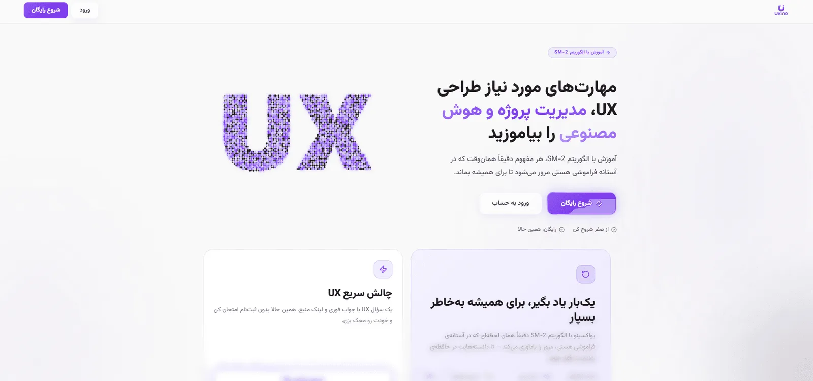
What the MVP looked like, and how the design changed in phase two. Click an image to enlarge it.
What I took away
A solo designer-developer can ship a production-quality, instrumented product in days by using AI as a collaborator. The product stalled for a business reason, not a design one.
What went wrong
- At launch AI was not yet a trend. Many people came out of curiosity, to see how a designer can build a whole product with AI.
- Traffic fell sharply afterwards. Most visitors only looked and left, a small share registered and fewer still started a lesson.
- The server had a real monthly cost and I had no financial plan for it, so the project is paused for now.
- I found real usability bugs (a long registration form, no answer feedback, scroll position) only after users arrived.
What I would do next time
- Plan the business side before launch: who pays, and what the server costs per month.
- Test the first-run flow with a few people before launching.
- Measure a repeat visit, not only the first visit.